Sunday, May 1, 2011

Monday, March 28, 2011

Sunday, March 20, 2011

Monday, February 28, 2011
Video Response
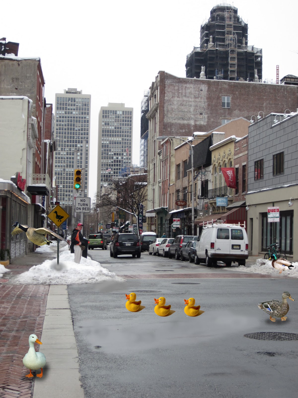
Today in class, we watched a few videos on the appropriation of images/ideas and copyright infringement. The first video focused on the idea that our generation of teens works with appropriation of images more than any generation has ever before. The talk show host showed funny examples of how people have taken videos and matched them up with different songs to change the meaning. Another video showed a news story on how a 16-year-old girl's picture was taken from flickr and used in a Virgin Mobile ad campaign. We were also shown another example of how Gap made an Illustrator version of an image from someone's flickr account online and appropriated it on their clothing. All of these examples, particularly the second and third, bring up the issue of copyright infringement and raise many questions on what is crossing the line. I think that in both the Gap and Virgin Mobile ad cases, lines were definitely crossed. Although these images were put up on flickr, where they can be viewed by any random person surfing the internet, there should have been some consent by the people whose images were being used in the process. The 16-year-old girl, in my opinion, was definitely taken advantage of not only because she didn't even know that her picture was being used in the campaign, but also because she's not even of legal age yet. Also, the ads included insulting texts next to her picture which is a whole other problem within itself. Everyone has their own personal rights, and her rights were definitely violated. The Gap example is a little more hazy because it's not certain that their image and the flickr image are absolutely the same image, but they are extremely eerily similar. I don't think that this example is as big of a deal though because it wasn't literally the same exact image as the one on flickr, but I definitely don't think it's fair that the Gap can go ahead and take someone else's image without being given consent and probably still win in court, when it would never work the other way around. I don't think that the first example is crossing the line really on the other hand because in this example, people are taking two completely different things and setting them in a new context. It makes me think of how in art, nothing is really ever completely unique because everyone gets their ideas from somewhere. General ideas in artwork have been repeated over and over again throughout time but have been changed accordingly. One of the things I thought of was how in art history, we have been learning about religious art from the Italian Renaissance and how so many paintings were produced portraying biblical scenes and figures, but how despite having the same subjects, the paintings are still different from artist to artist. Also, just in the foundations program in our studio classes, we are allowed to take images from the internet and use them in our projects and sketchbooks, or draw from them for drawing class, or model our idea off of something from the internet for 3D. A lot of times, there is a clear different in between two different works using the same image. And again, ideas for original images had to be taken from somewhere. This also reminded me of an artist named Jeff Koons, who makes humungous sculptures of every day mundane objects. One of his works was a huge shiny sculpture of a balloon dog. Some time after, a bookstore in California started selling balloon dog bookends. Koons sued the bookstore for stealing his idea and in the end, he only won a dollar or something like that off of his case. This to me is just silly because it is clear that Koons didn't invent the balloon dog; he got the idea from somewhere. Overall, I just think that people take ideas and images from each other and the internet as well every day but it's not always wrong if they set said ideas/images in a new context to create different meaning.
Monday, February 21, 2011
Scanner Face Computers Assignment

For this assignment, we had to scan our face and then recreate it in Illustrator using the pen tool. This assignment was the first time I've ever really done a big project on Illustrator but I had a lot of fun doing it. It was interesting figuring out how to make the face look more realistic with different shapes and colors, scales, and opacity. I learned a lot of new things including how to use the pen tool, changing colors, opacity, arranging objects, zooming, etc. Overall, I enjoyed this assignment a lot.
Monday, February 14, 2011
Sunday, February 6, 2011
Saturday, January 29, 2011
Walk/Bike/Ride Adventure
So for my walk/bike/ride adventure, I decided to go into Old City. I went there last night with some friends to a restaurant called Bleu Martini to celebrate my birthday. It was also the last day of restaurant week so we wanted to take advantage of that. It was a 3-course meal -- I got calamari, chicken spaghetti, and chocolate cheesecake. It was delicious. I really liked it there so I decided to come back today to get some good pictures in daylight. I took the Broad Street Line southbound to City Hall, then transferred on the Market-Frankford Line eastbound to 2nd street. I walked around for about an hour, taking pictures of the shops and restaurants such as the Continental, Bleu Martini, an Irish pub, etc. I also saw Penn's Landing. I had been to Penn's Landing several times before today to take the ferry over to Susquehanna Bank Center, but I had no idea about all of the shops and restaurants near there. First I walked down S 2nd Street, then around Bank St and Church St, etc. Then I went to this record store called "A.k.a Music". It was really neat because it had a bunch of used CDs, new CDs, and vinyl records sold really cheap. I spent the majority of my time in that store looking around. I also picked up a bunch of flyers and business cards there for events around Philly. I ended up buying a CD by a band called Passion Pit. Then I went on the subway back to Temple. Old City was really nice and peaceful. I will definitely be going back there in the spring time.
Sunday, December 5, 2010
Drawing Final - Week 2
After looking at Jan Van Eyck's "Arnolfini Marriage," I tried to come up with ways I could integrate ideas from that into my drawing. I wasn't really sure which direction to go in from there so I made a list of my thoughts, feelings, ideas, and things that I definitely wanted to include in the drawing. The list consists of:
3/4 view of my face
dramatic shadows
hands
arms
necklace
vulnerability
demand
stress
art
expression
abstraction
my bedroom?
park?
asymmetrical composition
eyes
So I decided I definitely wanted to an asymmetrical composition because I really enjoyed doing that in the last drawing assignment. At first I wanted to have just a drawing of my face in it, but then I realized we had to have an entire figure in the drawing so I decided I would draw most of my body to the left of the page with a 3/4 view of my face and my eyes staring at the viewer. I decided I wanted to do an [somewhat abstracted] expressive portrait that conveys vulnerability and demand in the art world. I started google searching words such as "portraits," "figures," "vulnerability," "abstract," "asymmetrical composition" and "expressionism". This is what I came up with for inspiration:
 |
| Listperson III by Patricia Allingham Carlson |
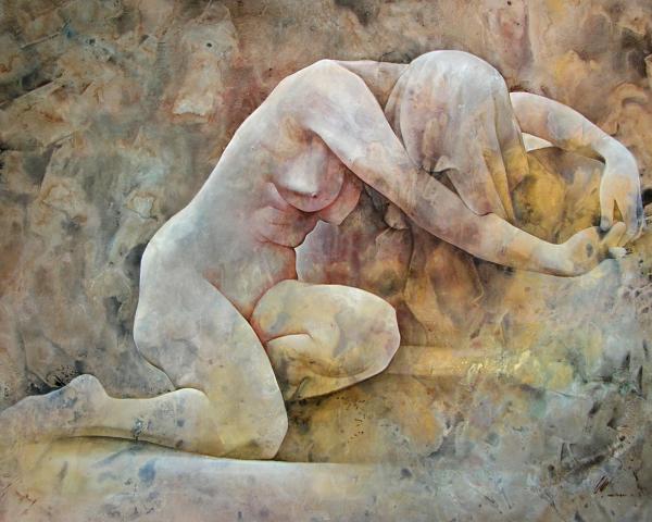 |
| Vulnerability by Chris Lopez |
 |
| Number 1A, 1948 (?) by Jackson Pollock |
 |
| Anarchy by Roseanne Jones |
 |
| Les Demoiselles D'Avignon by Picasso |
Sunday, November 28, 2010
Drawing Final - Week 1
So after studying Hans Holbein's "The Ambassadors," I decided to google search art from the Renaissance to see more works form the same time period. The first work that caught my eye was Jan Van Eyck's "Arnolfini Marriage" as shown here:
 I vaguely remember learning about this piece in my drawing and painting class in high school. The one thing that stands out the most to me is the mirror in the background. I think it's interesting how even though there are two figures in the foreground of the painting, they are not necessarily the main focus of the piece -- the mirror is. I searched this painting on wikipedia ( http://en.wikipedia.org/wiki/Arnolfini_Portrait ) for some general information about it and found that this painting is often referenced for its "immaculate non-Euclidean geometry" due to the image that is drawn on the convex mirror. Also, there is a lot of symbolism in this piece, through the dog, the mirror, the chandelier, the green dress, etc. I really like the whole idea of this painting and the composition. I like how the two figures and the chandelier frame the mirror in the background, the symbolism, and how the painting tells a story.
This is all I have found so far but I am going to use this painting as another reference point to lead me in my direction. I am thinking that I am going to do a composition similar to this one.

This is all I have found so far but I am going to use this painting as another reference point to lead me in my direction. I am thinking that I am going to do a composition similar to this one.
Thursday, November 18, 2010
In-Class Drawings
These are posted a little late so here's my attempt at putting them in order from first to last to show the progression (if I can remember correctly)!:
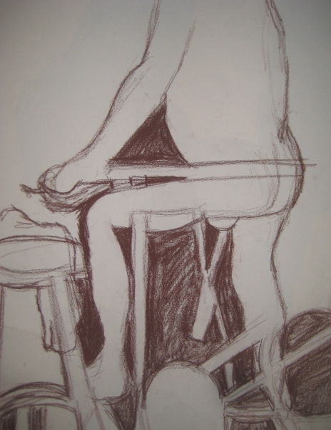 |
| Conte; negative space drawing |
 |
| Graphite; volume drawing |
 |
| Graphite; volume drawing |
 |
| Graphite; volume drawing |
 |
| Graphite; volume drawing |
 |
| Vine charcoal; remix |
 |
| Vine charcoal; remix |
 |
| Vine charcoal; remix |
 |
| Vine charcoal & compressed charcoal |
 |
| Vine charcoal, charcoal pencil, & compressed charcoal |
 |
| (Out of order but I can't figure how to move to the right spot... hahah) Perspective drawing |
Asymmetrical Balance
 |
| 3 ft x 4 ft; graphite, vine charcoal, compressed charcoal, & ink figure seated to the left with three torsos extending to the right side |
Sunday, November 7, 2010
Quote Assignment
"The point is, that every piece of art changes your whole perception of the rest of the world for the rest of your life. And it's not a joke! And if it doesn't, then it's not art, it's a commodity."
-Lawrence Weiner
I strongly agree with this quote. Art in and of itself embodies an artist’s interpretation of the world in general. Art is full of opinion and controversy. Art is something that is hard to judge because it is really all about perception and how the viewer sees a piece of work. Art is meant to make people think and to see new things that they may have never even thought about before.
This quote makes me think of my experience in the foundations program at Tyler. Every project and critique is a new learning experience. Every time I produce a new work, my point of view is altered, and every time I see other students’ work, my point of view is altered even further. As my point of view is constantly changing, I look at the world in a whole different light. I believe that that is the point. Art is not produced simply to look at. It is produced to make people think in new ways. It’s kind of like how when I produce a new piece, my view of that work changes completely when I’m finished it from when I am actually working on it. And then when I bring my work in to be critiqued, my view is further changed because I notice new things that I didn’t see before that. And every time after that, when I work on something new, I think back to my previous work, or to other works I’ve seen done by other artists or other students and I accommodate those memories and understanding into how I take on another project. Art produces a cycle of experience, taking from experiences and changing the way we perceive everything. I think that such a notion is the whole point of art in general. Art conveys meaning and through meaning, we experience new thoughts, ideas, emotions, etc. Without those experiences, art is meaningless. Art would be nothing but a material item. And in that case, it simply would not be art anymore.
I don’t think art can be both art and a commodity simultaneously. I think that art can only be art. A commodity is something solid and concrete that can be used. Yes, a commodity helps us in some way, as art does as well. But the purpose of a commodity is to help complete a task. The purpose of art is to help the viewer see things differently. A commodity does not exist as an art form. It does not convey some sort of meaning that changes our perception of the world, and that idea is what draws a fine line between art being a commodity and still being art. Although I don’t think art is a commodity, I do think that art and commodity can be a dichotomy. A dichotomy contains two opposed groups that each have unique characteristics specific to its own group. Art and commodities are somewhat similar to each other because they are both useful and contribute to the world. They may balance each other out because a commodity could be argued as a form of functional art in some cases. But when I think of commodities, I think of something that you can buy off the shelf at a store, or something that you can trade… something material or something that works to get a set end result. I think of something that was made in a factory. When I think of art, I think of something that was produced in a studio, something hand-crafted, something that was worked on for hours upon hours, something that had a lot of thought put into it. From an artist’s point of view, it is important to think of what meaning a piece of work is going to convey to the viewers. Thinking about meaning is part of the artistic process. It is in the nature of making art to change a viewer’s perception. A commodity doesn’t really have artistic process or purpose in it. A commodity is just kind of there to be used. Maybe I have interpreted a commodity wrong, but that is just what I think.
-Lawrence Weiner
I strongly agree with this quote. Art in and of itself embodies an artist’s interpretation of the world in general. Art is full of opinion and controversy. Art is something that is hard to judge because it is really all about perception and how the viewer sees a piece of work. Art is meant to make people think and to see new things that they may have never even thought about before.
This quote makes me think of my experience in the foundations program at Tyler. Every project and critique is a new learning experience. Every time I produce a new work, my point of view is altered, and every time I see other students’ work, my point of view is altered even further. As my point of view is constantly changing, I look at the world in a whole different light. I believe that that is the point. Art is not produced simply to look at. It is produced to make people think in new ways. It’s kind of like how when I produce a new piece, my view of that work changes completely when I’m finished it from when I am actually working on it. And then when I bring my work in to be critiqued, my view is further changed because I notice new things that I didn’t see before that. And every time after that, when I work on something new, I think back to my previous work, or to other works I’ve seen done by other artists or other students and I accommodate those memories and understanding into how I take on another project. Art produces a cycle of experience, taking from experiences and changing the way we perceive everything. I think that such a notion is the whole point of art in general. Art conveys meaning and through meaning, we experience new thoughts, ideas, emotions, etc. Without those experiences, art is meaningless. Art would be nothing but a material item. And in that case, it simply would not be art anymore.
I don’t think art can be both art and a commodity simultaneously. I think that art can only be art. A commodity is something solid and concrete that can be used. Yes, a commodity helps us in some way, as art does as well. But the purpose of a commodity is to help complete a task. The purpose of art is to help the viewer see things differently. A commodity does not exist as an art form. It does not convey some sort of meaning that changes our perception of the world, and that idea is what draws a fine line between art being a commodity and still being art. Although I don’t think art is a commodity, I do think that art and commodity can be a dichotomy. A dichotomy contains two opposed groups that each have unique characteristics specific to its own group. Art and commodities are somewhat similar to each other because they are both useful and contribute to the world. They may balance each other out because a commodity could be argued as a form of functional art in some cases. But when I think of commodities, I think of something that you can buy off the shelf at a store, or something that you can trade… something material or something that works to get a set end result. I think of something that was made in a factory. When I think of art, I think of something that was produced in a studio, something hand-crafted, something that was worked on for hours upon hours, something that had a lot of thought put into it. From an artist’s point of view, it is important to think of what meaning a piece of work is going to convey to the viewers. Thinking about meaning is part of the artistic process. It is in the nature of making art to change a viewer’s perception. A commodity doesn’t really have artistic process or purpose in it. A commodity is just kind of there to be used. Maybe I have interpreted a commodity wrong, but that is just what I think.
Thursday, October 21, 2010
Layer Figure Drawings
 |
| attempt 1(Frankie) ; pencil drawings underneath with charcoal over top |
 |
| attempt 2 (Emily) ; pen drawings underneath with charcoal over top |


Sunday, October 3, 2010
Persona Drawing From Memory
 |
| on rives printing paper -- 22x29 i believe?; charcoal & ink |
Wednesday, September 29, 2010
Persona
Today, we watched a Swedish film entitled “Persona,” directed by Ingmar Bergman. The film lasted for about an hour and a half, was entirely in black and white, and had subtitles. I’m not much of a fan for black and white films, or subtitles, but the movie turned out to be quite intriguing in my opinion.
In the opening scene, various disturbing images and video clips are flashed across the screen at a fast pace – a hand with a nail being hammered through it, an old woman looking up at the sky, a young boy tossing around in his bed, a man’s genitalia, etc. The images left me feeling confused and slightly uncomfortable. After the series of images, the story line of the film begins.
The film follows the progression of a relationship between two women, Elisabet Vogler and Sister Alma. Elisabet is a famous actress who is admitted to the hospital after she refuses to talk anymore, or do anything for that matter. Sister Alma, a nurse at the hospital, is called upon to help and watch over Elisabet because the doctor thinks Sister Alma will be good for Elisabet. Then, they are sent to live in a summerhouse by the seashore in isolation. Because Elisabet refuses to speak, Sister Alma opens up and reveals many of her secrets to Elisabet. Sister Alma feels that she can trust Elisabet very much, until she finds a letter written by Elisabet to her doctor concerning Sister Alma’s secrets, which is the rising action of the plot. The two women have a falling out, and eventually Sister Alma finds herself being emerged into Elisabet’s persona. The story line ends as Alma catches herself from being completely drawn into Elisabet’s persona and ultimately leaves Elisabet by herself in a catatonic state. The film ends the same as it began, showing the same disturbing images.
I really didn’t know what to think at first after viewing this film. The film was certainly not like any other film I’ve ever seen before. It’s very dark and intense, both psychologically and visually. The relationship between Elisabet and Sister Alma is reflected in the visual darkness and contrast used in the film. All of the scenes have very dark shadows and bright whites within the figures and backgrounds. A lot of texture and pattern is also used within the scenes. Each scene was striking and memorable as an individual image.
In the film, when Sister Alma finds out that Elisabet revealed her secrets to her doctor, Alma becomes extremely angry. Alma lashes out at Elisabet and says something powerful:
“I thought that great artists had great compassion for people… that they created through a great compassion and a need to help.”
This quote was quite thought provoking. It raises the question of what art is used for. Is art a way of hiding oneself from the world? Or is it a way to show the world who you really are? To me, art is something that people create in order to tell a story – whether it be literal or metaphorical. Art isn’t something to hide behind; it is something used to come out from hiding. Art IS created through compassion, among many other things. Although, in the film, I believe that Elisabet uses theatre as a way of hiding who she truly is. Even though the audience doesn’t see Elisabet physically acting on a stage at any point of the movie, it is very apparent that her persona actually comes out when she doesn’t speak for months, because of the way it’s inflicted upon Sister Alma. As viewers, we begin to see where Sister Alma’s rage, confusion, happiness, and sadness come from. We see a transformation from when she first starts taking care of Elisabet, the growth of their relationship, and when she leaves Elisabet in the end. It’s interesting to think about how much one person can impact another person, even without speaking.
Overall, I thought the film was very well composed. To be honest, I am still not entirely sure how I feel about it even after giving it a lot of thought, but I definitely enjoyed it. I thought the images were intricate and dramatic, yet simply beautiful at the same time. I enjoyed the different angles from which the scenes were shot, and the tone and contrast throughout the film. I think that Bergman’s close attention to the visual aspects of the film made it much more enjoyable to watch.
In the opening scene, various disturbing images and video clips are flashed across the screen at a fast pace – a hand with a nail being hammered through it, an old woman looking up at the sky, a young boy tossing around in his bed, a man’s genitalia, etc. The images left me feeling confused and slightly uncomfortable. After the series of images, the story line of the film begins.
The film follows the progression of a relationship between two women, Elisabet Vogler and Sister Alma. Elisabet is a famous actress who is admitted to the hospital after she refuses to talk anymore, or do anything for that matter. Sister Alma, a nurse at the hospital, is called upon to help and watch over Elisabet because the doctor thinks Sister Alma will be good for Elisabet. Then, they are sent to live in a summerhouse by the seashore in isolation. Because Elisabet refuses to speak, Sister Alma opens up and reveals many of her secrets to Elisabet. Sister Alma feels that she can trust Elisabet very much, until she finds a letter written by Elisabet to her doctor concerning Sister Alma’s secrets, which is the rising action of the plot. The two women have a falling out, and eventually Sister Alma finds herself being emerged into Elisabet’s persona. The story line ends as Alma catches herself from being completely drawn into Elisabet’s persona and ultimately leaves Elisabet by herself in a catatonic state. The film ends the same as it began, showing the same disturbing images.
I really didn’t know what to think at first after viewing this film. The film was certainly not like any other film I’ve ever seen before. It’s very dark and intense, both psychologically and visually. The relationship between Elisabet and Sister Alma is reflected in the visual darkness and contrast used in the film. All of the scenes have very dark shadows and bright whites within the figures and backgrounds. A lot of texture and pattern is also used within the scenes. Each scene was striking and memorable as an individual image.
In the film, when Sister Alma finds out that Elisabet revealed her secrets to her doctor, Alma becomes extremely angry. Alma lashes out at Elisabet and says something powerful:
“I thought that great artists had great compassion for people… that they created through a great compassion and a need to help.”
This quote was quite thought provoking. It raises the question of what art is used for. Is art a way of hiding oneself from the world? Or is it a way to show the world who you really are? To me, art is something that people create in order to tell a story – whether it be literal or metaphorical. Art isn’t something to hide behind; it is something used to come out from hiding. Art IS created through compassion, among many other things. Although, in the film, I believe that Elisabet uses theatre as a way of hiding who she truly is. Even though the audience doesn’t see Elisabet physically acting on a stage at any point of the movie, it is very apparent that her persona actually comes out when she doesn’t speak for months, because of the way it’s inflicted upon Sister Alma. As viewers, we begin to see where Sister Alma’s rage, confusion, happiness, and sadness come from. We see a transformation from when she first starts taking care of Elisabet, the growth of their relationship, and when she leaves Elisabet in the end. It’s interesting to think about how much one person can impact another person, even without speaking.
Overall, I thought the film was very well composed. To be honest, I am still not entirely sure how I feel about it even after giving it a lot of thought, but I definitely enjoyed it. I thought the images were intricate and dramatic, yet simply beautiful at the same time. I enjoyed the different angles from which the scenes were shot, and the tone and contrast throughout the film. I think that Bergman’s close attention to the visual aspects of the film made it much more enjoyable to watch.
Monday, September 27, 2010
Laura Newman
In my reading, I came across an article entitled, “Laura Newman: On The Verge” which was posted on Sunday, September 5th, 2010 on ‘Two Coats of Paint’. The article was written by Sharon Butler, an artist who created the blog in order to share her collection of art criticisms. Her article displays excerpts from another essay entitled, “Laura Newman: Glass Walls and Billboards” which was written by Amy Sillman.
Sillman’s article explains Newman’s work in various different ways, some of which is confusing but some of which is also very intriguing. Laura Newman is a painter who uses abstract forms to create meaning. In her paintings, she lends a different perspective on simple shapes. She uses “parallax view,” a binocular cue that is the displacement in position of an object when viewed through two different lines of sight. Through parallax view, she creates double meanings. The subjects of Newman’s paintings are ordinary ones – houses, walls, fences, windows, horizon lines – however, she abstracts them in a way that they create slight optical illusions. She likes to fool the viewer’s eye into seeing the opposite of what is actually there; for example, close objects appear farther away, flat planes are cut out into separate shapes, minimal shapes represent something more complex, etc. She also embraces negative space in her paintings by incorporating it into the entire picture. In addition to paying close attention to shape and form, Newman also uses a variety of color to make her paintings all the more appealing. She layers unrelated colors that settle near each other to create lively work.
In the article “Laura Newman: On The Verge”, Butler includes a quote from Laura Newman that I enjoyed a fair bit. I thought that the quote explained her work perfectly: “[…] Suggestions of compression and restriction contrast with a sense of breaking free and soaring in thin air.” This quote describes how she utilizes space on the canvas to create interesting and thought-provoking compositions. I really like the fact that she creates double meanings within her work through parallax view. Her work is modern, fresh, and pleasing to look at. I also love her use of color, shape, and colors within shapes. Although she uses simple shapes to create a larger picture, she still finds a way to add complexity to her work as well, and it’s quite exciting.
I think that all of the different techniques that Newman factors into her paintings are absolutely relevant to talking about in art. Newman creates a whole new point of view on common every-day objects. When I look at her paintings, many different words come to mind: perspective, angle, shape, form, color, composition, negative space, positive space, light, dark, tone, range, etc. I also think that all of these things are the essence of her pieces. It is apparent that she intends to create different views, as well as simple yet complex compositions. Before reading these articles, I had never heard of Laura Newman, however I am now interested in her. I enjoy her spin on double meaning and parallax view, and how she takes ordinary things and makes them interesting. I also enjoy how she uses negative space as part of the whole picture, rather than leaving it as something forgotten. I think that negative space is equally important as the objects that take up the rest of the space in a painting. Essentially, I enjoy her style altogether. From a purely visual standpoint, her pieces evoke a sense of happiness to me. Overall, her choice of color is uplifting and amusing to look at. I am very glad to have come across this article and discovered a new artist.
Sillman’s article explains Newman’s work in various different ways, some of which is confusing but some of which is also very intriguing. Laura Newman is a painter who uses abstract forms to create meaning. In her paintings, she lends a different perspective on simple shapes. She uses “parallax view,” a binocular cue that is the displacement in position of an object when viewed through two different lines of sight. Through parallax view, she creates double meanings. The subjects of Newman’s paintings are ordinary ones – houses, walls, fences, windows, horizon lines – however, she abstracts them in a way that they create slight optical illusions. She likes to fool the viewer’s eye into seeing the opposite of what is actually there; for example, close objects appear farther away, flat planes are cut out into separate shapes, minimal shapes represent something more complex, etc. She also embraces negative space in her paintings by incorporating it into the entire picture. In addition to paying close attention to shape and form, Newman also uses a variety of color to make her paintings all the more appealing. She layers unrelated colors that settle near each other to create lively work.
In the article “Laura Newman: On The Verge”, Butler includes a quote from Laura Newman that I enjoyed a fair bit. I thought that the quote explained her work perfectly: “[…] Suggestions of compression and restriction contrast with a sense of breaking free and soaring in thin air.” This quote describes how she utilizes space on the canvas to create interesting and thought-provoking compositions. I really like the fact that she creates double meanings within her work through parallax view. Her work is modern, fresh, and pleasing to look at. I also love her use of color, shape, and colors within shapes. Although she uses simple shapes to create a larger picture, she still finds a way to add complexity to her work as well, and it’s quite exciting.
I think that all of the different techniques that Newman factors into her paintings are absolutely relevant to talking about in art. Newman creates a whole new point of view on common every-day objects. When I look at her paintings, many different words come to mind: perspective, angle, shape, form, color, composition, negative space, positive space, light, dark, tone, range, etc. I also think that all of these things are the essence of her pieces. It is apparent that she intends to create different views, as well as simple yet complex compositions. Before reading these articles, I had never heard of Laura Newman, however I am now interested in her. I enjoy her spin on double meaning and parallax view, and how she takes ordinary things and makes them interesting. I also enjoy how she uses negative space as part of the whole picture, rather than leaving it as something forgotten. I think that negative space is equally important as the objects that take up the rest of the space in a painting. Essentially, I enjoy her style altogether. From a purely visual standpoint, her pieces evoke a sense of happiness to me. Overall, her choice of color is uplifting and amusing to look at. I am very glad to have come across this article and discovered a new artist.
Here are my two favorite paintings that I came across by Laura Newman on her website:
 |
| "Bloom." 2009; Acrylic & Oil; 72x64" |
 |
| "Windstorm."; 2007; Watercolor/Flashe; 22x30" |
Check her site out!: http://lauranewman.com/index.html
Link to Butler's article: http://www.twocoatsofpaint.com
Link to Sillman's article: http://artcritical.com/2010/09/04/sillman-newman/
Wednesday, September 22, 2010
body contours
 |
| 5 ft; kind of hard to see because of the lighting / i'm too short :P attempt 1 |
 |
| 3 ft; head to waist attempt 2 |
Tuesday, September 21, 2010


Subscribe to:
Posts (Atom)